

dec 2024 - Mar 2025

UX/UI DESIGNER

FIGMA, PHOTOSHOP

PROJECT overview
VISION:
As the demands of modern life continue to evolve, the need for efficient and accessible services has never been greater. This flower delivery app has been meticulously designed to address these needs by offering a solution that combines time and cost efficiency with premium, modern floral arrangements. The app specifically caters to users who may have limited time and access to local florists, ensuring that high-quality floral options are available to everyone, regardless of their location or time constraints.
CHALLENGES:
Consumers today seek more than just convenience; they demand efficiency, cost-effectiveness, and premium quality. Traditional flower delivery services often fall short in these areas, with customers facing issues such as high delivery costs, limited access to modern and stylish floral designs, and time-consuming ordering processes. This gap creates a need for a service that combines affordability with high-quality, trend-setting floral options, delivered swiftly and seamlessly.
GOAL:
In designing this flower delivery app, I intend to represent a forward-thinking approach to floral services, meeting the needs of modern consumers through a blend of convenience, affordability, and premium quality. By providing accessible solutions for users unable to visit local florists, the app ensures that high-end, contemporary bouquets are within reach for everyone, regardless of their location.
the user
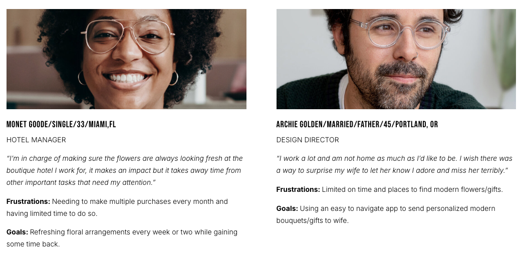
For the floral delivery app, user research included a combination of surveys, in-depth interviews, and usability testing. Initially, assumptions were made that users primarily valued speed and convenience when ordering flowers, and that price and selection were secondary factors. However, after conducting research, it became clear that customers also highly prioritized the emotional experience of giving flowers, with many users wanting a more thoughtful and curated selection for different occasions. This insight shifted the design focus to improving how the app could guide users to select the right flowers based on occasion, sentiment, or relationship, making the process feel more personalized without overwhelming the user.
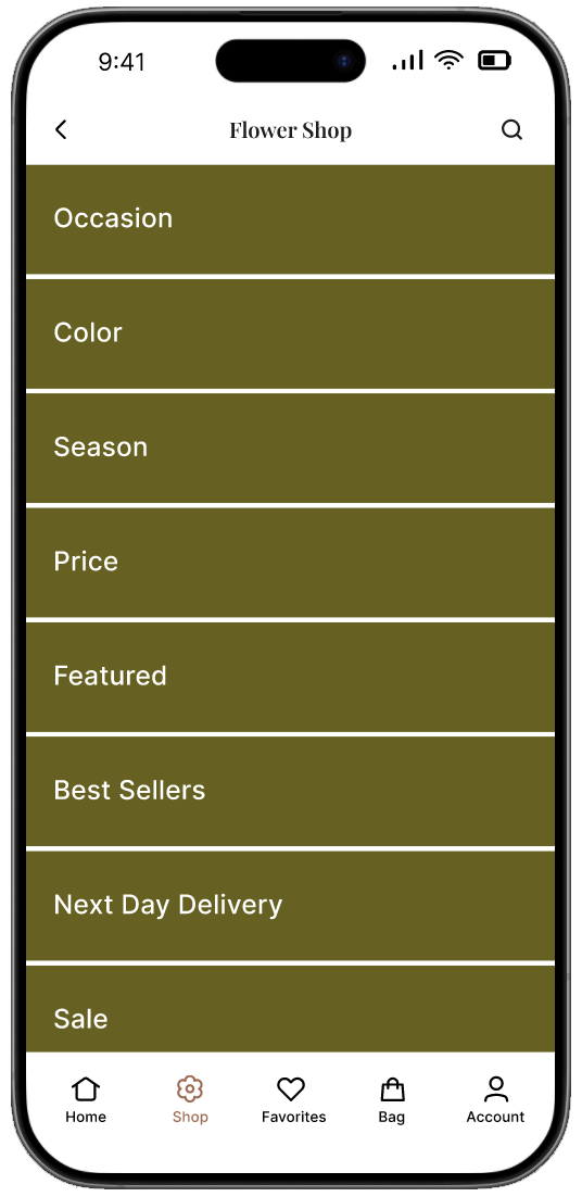
1. OVERWHELMING:
Pain points
Users struggle to find what they need due to an overwhelming layout, excessive text, or poorly organized categories. A lack of clear navigation and hierarchy makes the shopping experience frustrating and inefficient, leading to potential drop-offs.
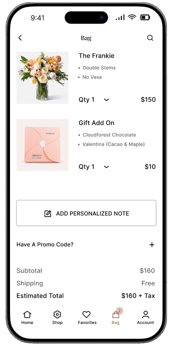
2. PERSONALIZATION:
Users feel limited in their ability to customize their orders, such as adding a heartfelt message, selecting specific bouquet sizes, or including small gifts. This restriction makes the experience feel less personal and special.
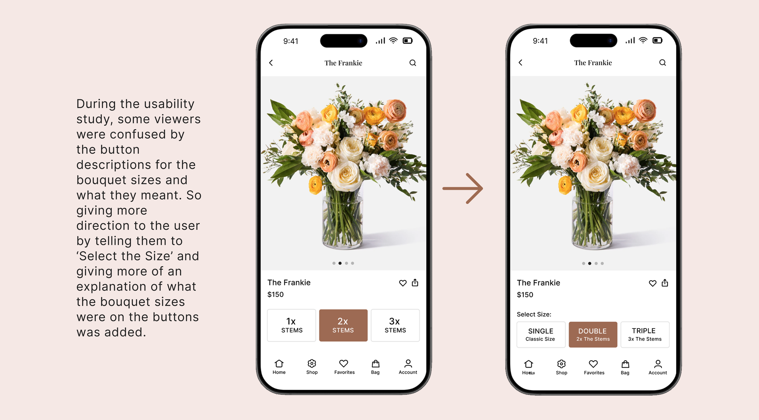
3. SIZING:
Users struggle to understand the size differences between bouquet options, making it difficult to choose the right one. Without clear visuals or size comparisons, they may worry about whether the bouquet will meet their expectations.
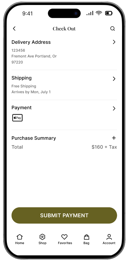
4. CHECK OUT:
Users find the checkout experience too long or confusing, leading to frustration and potential cart abandonment. Issues like too many steps, unclear pricing, or a lack of payment options can make completing a purchase difficult.
USER PERSONAS
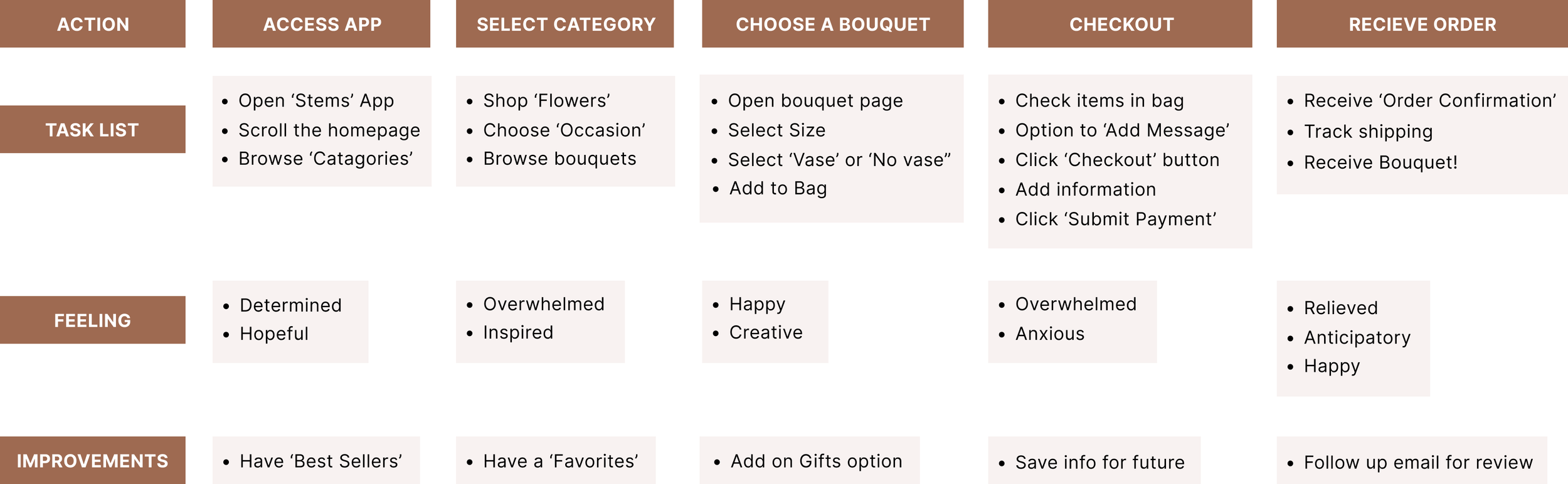
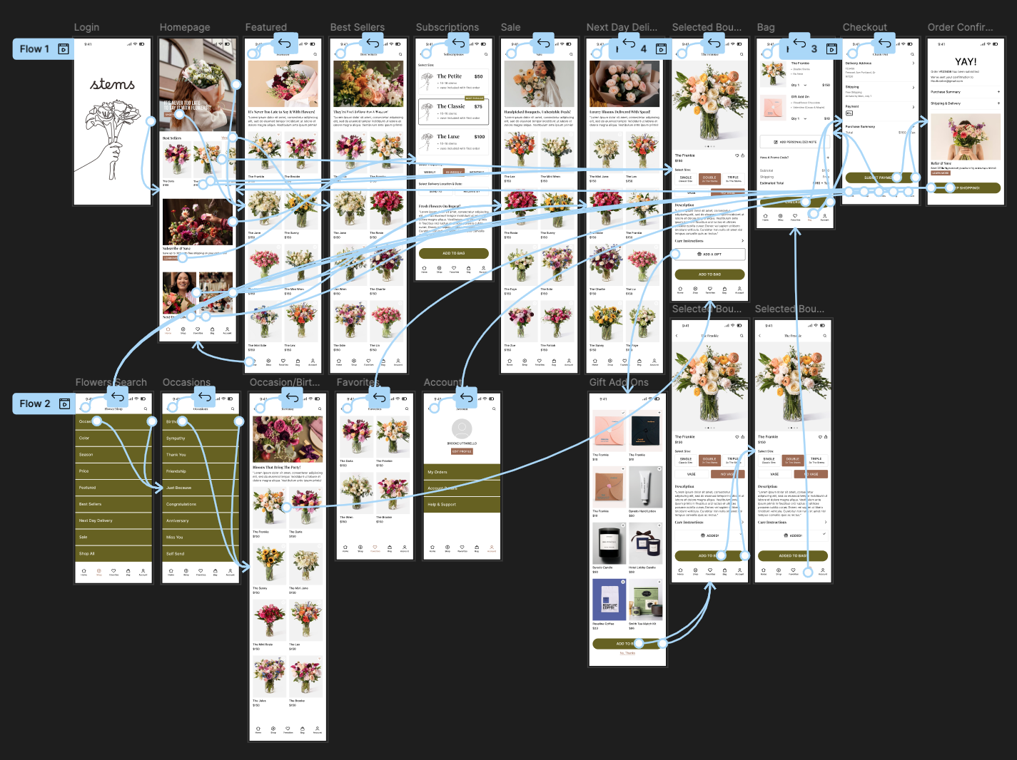
USER JOURNEY MAP
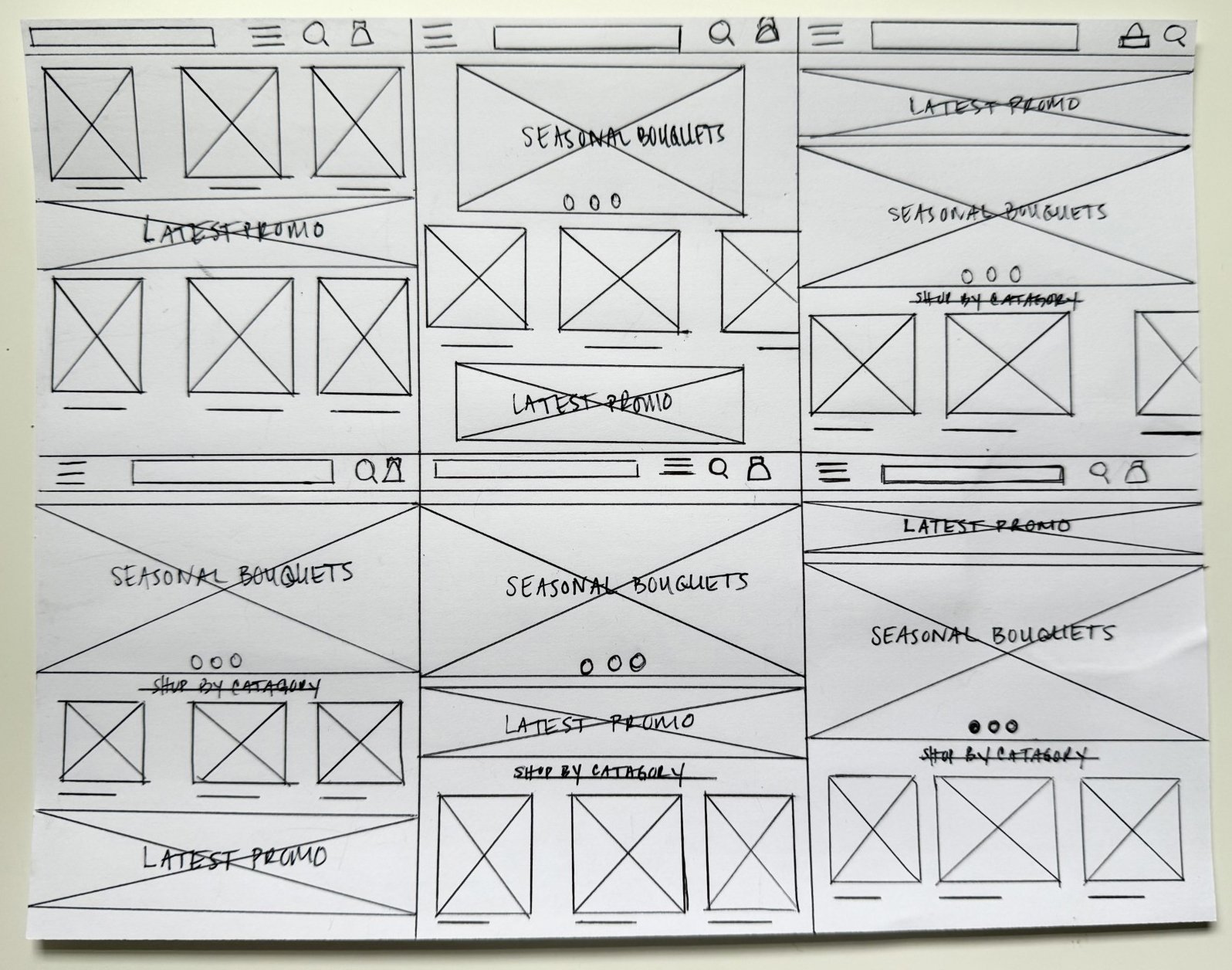
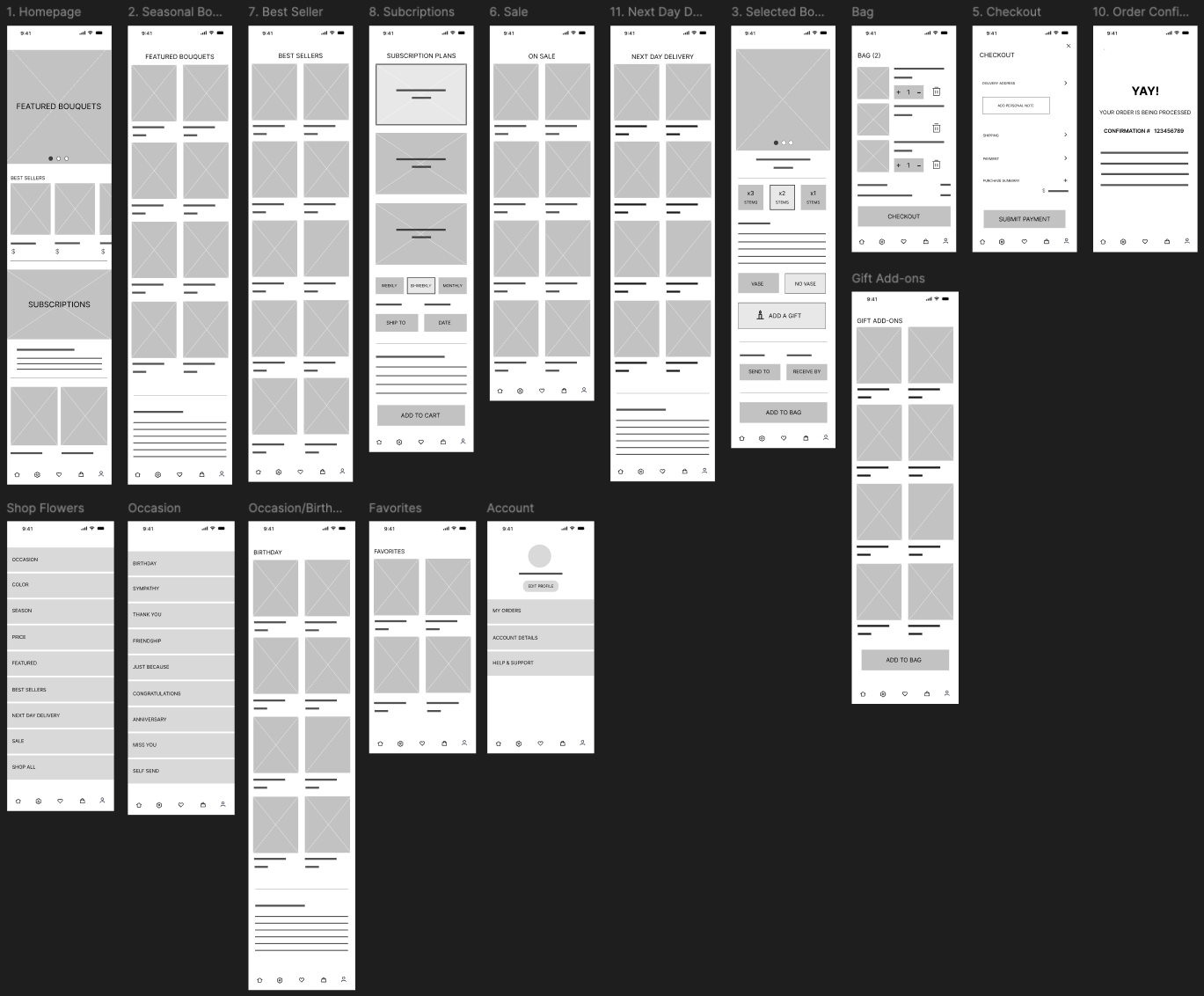
the design
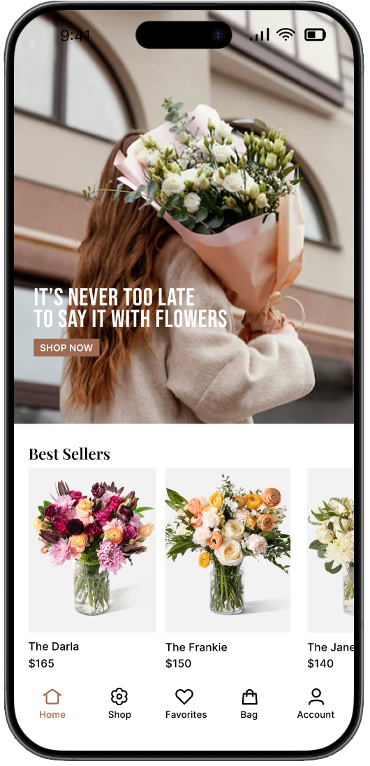
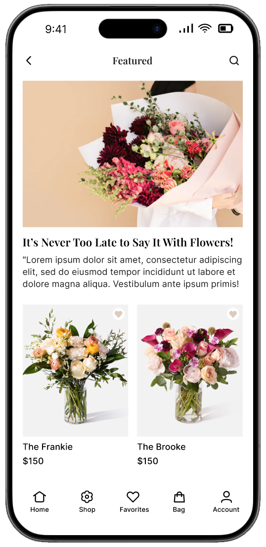
I focused on adding ‘Featured’ and ‘Best Sellers’ sections to the homepage to create an engaging and intuitive shopping experience. Featuring select products right away helps capture visitors' attention, showcasing top-quality or trending items without requiring them to browse deeply. The Best Sellers section builds trust by highlighting products that other customers love, reinforcing social proof and making purchasing decisions easier. These sections also streamline the user journey by reducing friction, allowing customers to quickly discover popular or promoted products. Overall, this approach enhances conversion rates, keeps the homepage dynamic, and improves overall user engagement.
usability study

Round 1 Findings

Round 2 Findings
refined design


TAKEAWAYS
Impact:
Learned: